


Lorem ipsum dolor, sit amet consectetur adipisicing elit. Iure vel officiis ipsum placeat itaque neque dolorem modi perspiciatis dolor distinctio veritatis sapiente, minima corrupti dolores necessitatibus suscipit accusantium dignissimos culpa cumque.
Ea nemo et dolorum quidem non est aut. Tempore delectus dolorum delectus omnis velit quia. Nobis eius atque occaeca
It is a long established fact that a reader will be distracted by the readable content of a page when looking at its layout.The point of using Lorem Ipsum is that it has a more-or-less normal distribution of letters.
- We want everything to look good out of the box.
- Really just the first reason, that's the whole point of the plugin.
- Here's a third pretend reason though a list with three items looks more realistic than a list with two items.
Typography should be easy
So that's a header for you — with any luck if we've done our job correctly that will look pretty reasonable. Something a wise person once told me about typography is:
Typography is pretty important if you don't want your stuff to look like trash. Make it good then it won't be bad.
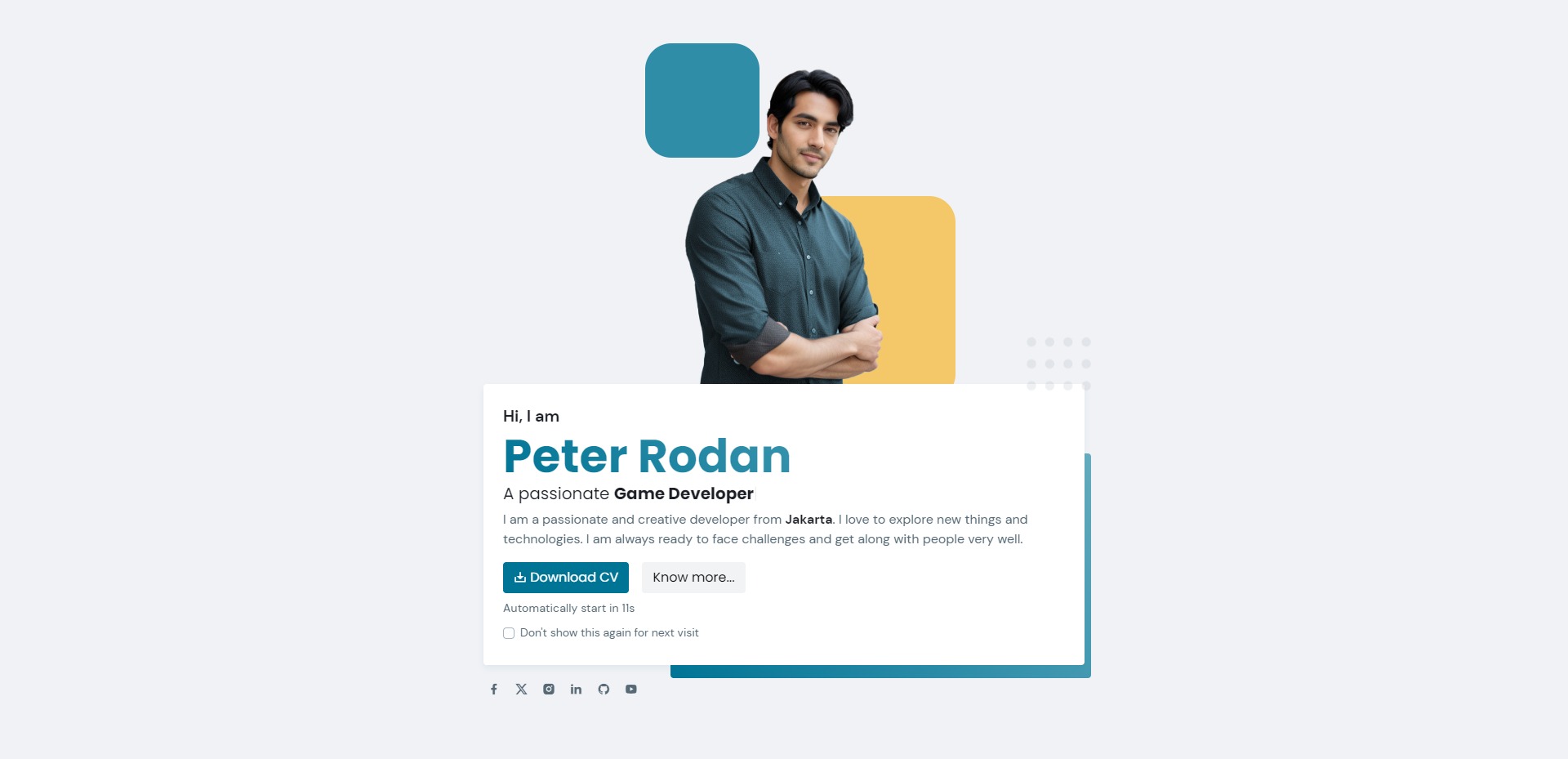
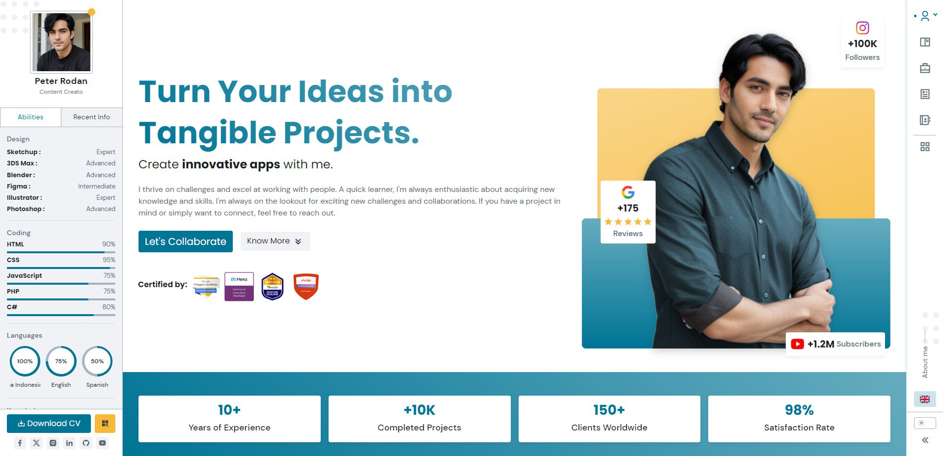
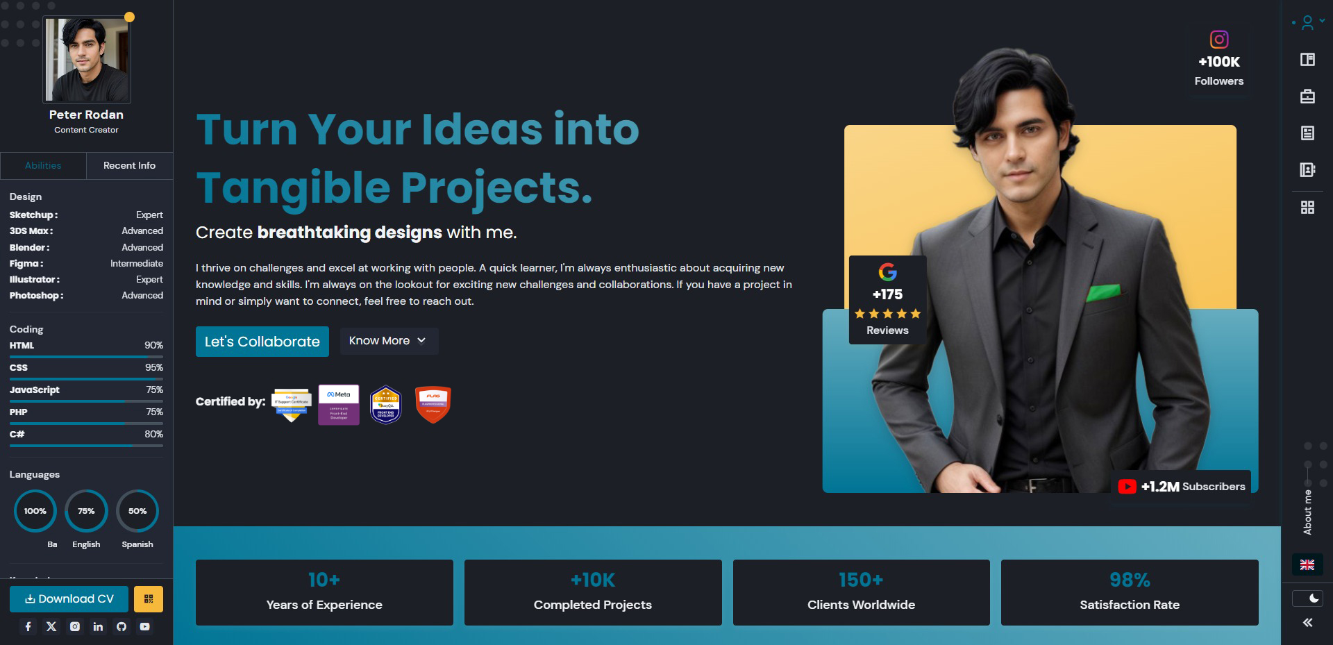
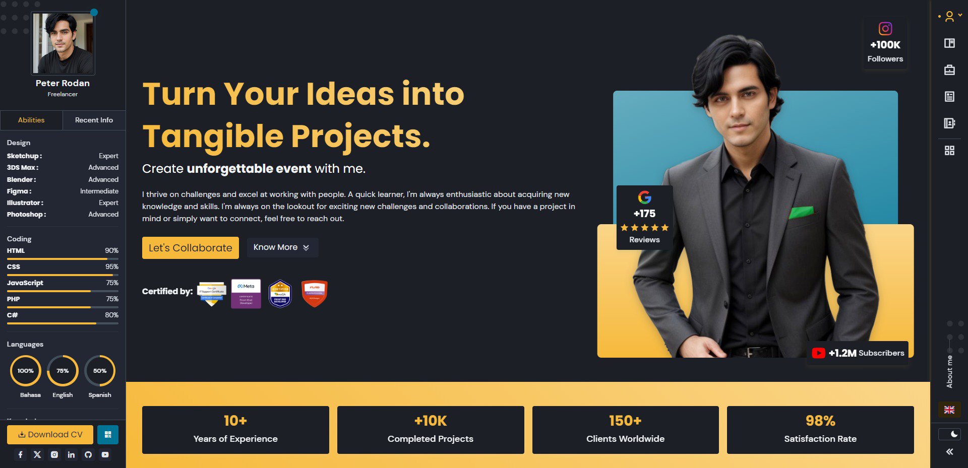
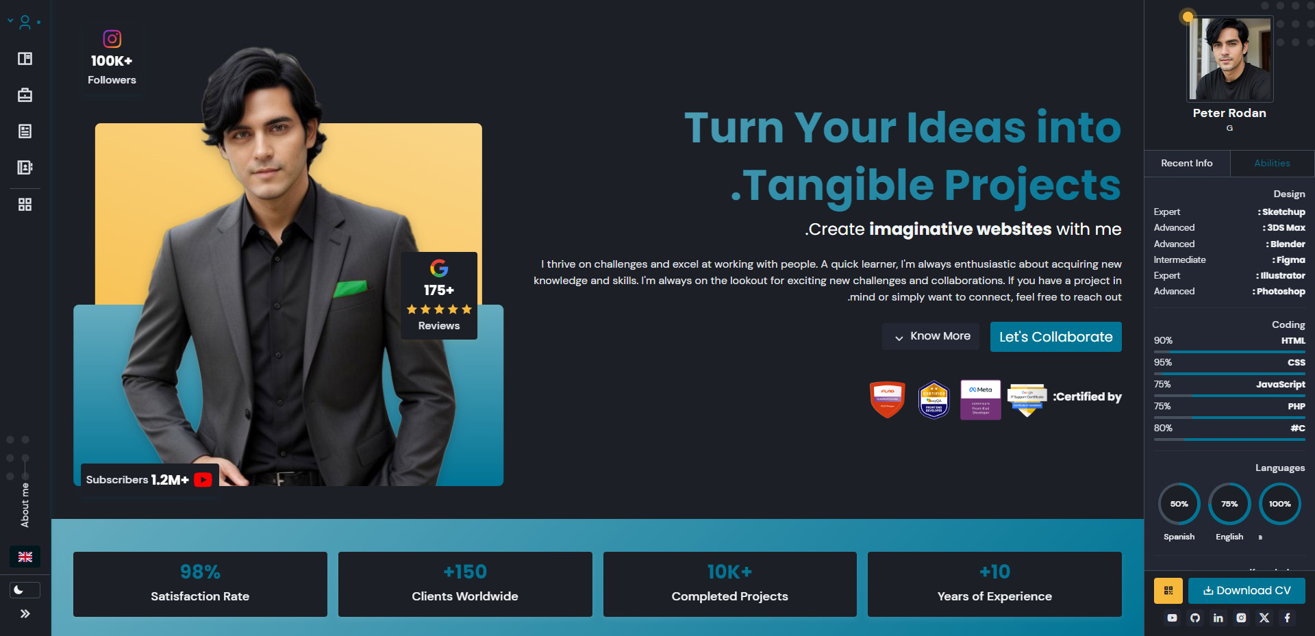
Peter Rodan
To switch directories, type cd followed by the name of the directory.
To edit settings, press Ctrl + ,
Viverra congue habitant eros senectus amet fringilla ornare lacinia magnis finibus. Hac consectetuer adipiscing purus interdum risus montes felis aliquet maecenas orci feugiat. Sed interdum vehicula elementum ridiculus feugiat ullamcorper litora mollis. Blandit maximus sapien volutpat consectetuer aenean quis porttitor. Quisque congue iaculis tempor ac suspendisse curabitur interdum ex finibus at mi.
What to expect from here on out
What follows from here is just a bunch of absolute nonsense I've written typographic element I could think of, like bold text, unordered lists, ordered lists, code blocks, block quotes, and even italics.
You can use the mark tag to highlight text.
This line of text is meant to be treated as deleted text.
This line of text is meant to be treated as no longer accurate.
This line of text is meant to be treated as an addition to the document.
This line of text will render as underlined.
This line of text is meant to be treated as fine print.
This line rendered as bold text.
This line rendered as italicized text.
Lacus praesent nam lacinia dolor consectetuer eros tempor libero bibendum. Est urna viverra vulputate auctor ornare. Mattis dictum ultrices hac nostra quam vulputate felis urna aenean. Volutpat imperdiet iaculis class fames risus faucibus nisl interdum. Consectetur non tempus fringilla dolor curabitur phasellus. Malesuada placerat vestibulum tempor senectus nisl netus metus finibus inceptos nam. Nec etiam phasellus orci cras tellus mus montes potenti.
It's important to cover all of these use cases for a few reasons:

Now I'm going to show you an example of an unordered list to make sure that looks good, too:
- So here is the first item in this list.
- In this example we're keeping the items short.
- Later, we'll use longer, more complex list items.
And that's the end of this section.
Code should look okay by default.
I think most people are going to use Prism or something if they want to style their code blocks but it wouldn't hurt to make them look okay out of the box, even with no syntax highlighting.
What I've written here is probably long enough, but adding this final sentence can't hurt.
Hopefully that looks good enough to you.


There are other elements we need to style
I almost forgot to mention links, like this link to the Bootstrap CSS website. We almost made them blue but that's so yesterday, so we went with dark gray, feels edgier.
We even included table styles, check it out:
| Wrestler | Origin | Finisher |
|---|---|---|
| Bret “The Hitman” Hart | Calgary, AB | Sharpshooter |
| Stone Cold Steve Austin | Austin, TX | Stone Cold Stunner |
| Randy Savage | Sarasota, FL | Elbow Drop |
| Vader | Boulder, CO | Vader Bomb |
| Razor Ramon | Chuluota, FL | Razor's Edge |
We also need to make sure inline code looks good, like if I wanted to talk about <span> elements or tell you the good news about @bootstrap/typography.
Phew, with any luck we have styled the headings above this text and they look pretty good.
Ea nemo et dolorum quidem non est aut. Tempore delectus dolorum delectus omnis velit quia. Nobis eius atque occaeca
Let's add a closing paragraph here so things end with a decently sized block of text. I can't explain why I want things to end that way but I have to assume it's because I think things will look weird or unbalanced if there is a heading too close to the end of the document.


Total 5 Comments
Cras egestas dictumst netus pharetra curae ipsum morbi. Rutrum morbi diam tortor conubia quis felis mus magna gravida viverra. Aptent donec placerat tempor mattis taciti feugiat dictum cursus.
Cras egestas dictumst netus pharetra curae ipsum morbi. Rutrum morbi diam tortor conubia quis felis mus magna gravida viverra. Aptent donec placerat tempor mattis taciti feugiat dictum cursus.
Cras egestas dictumst netus pharetra curae ipsum morbi. Rutrum morbi diam tortor conubia quis felis mus magna gravida viverra. Aptent donec placerat tempor mattis taciti feugiat dictum cursus.
Cras egestas dictumst netus pharetra curae ipsum morbi. Rutrum morbi diam tortor conubia quis felis mus magna gravida viverra. Aptent donec placerat tempor mattis taciti feugiat dictum cursus.